Intro
Commercial Real Estate (CRE) is inordinately nuanced. Among different rules, restrictions, and a litany of data points, the “volumes” of the CRE Encyclopedia seem never-ending. CompStak, fortunately, endeavors to advocate for simplicity by building tools and providing timely, accurate data for CRE professionals who exist in this complex space. These professionals need to understand the nature of relationships between properties, tenancy, ownership, and host of other attributes crucial to their jobs. Powered by a robust database of leasing information, CompStak is perfectly positioned to help facilitate these professionals’ day-to-days.
Concept
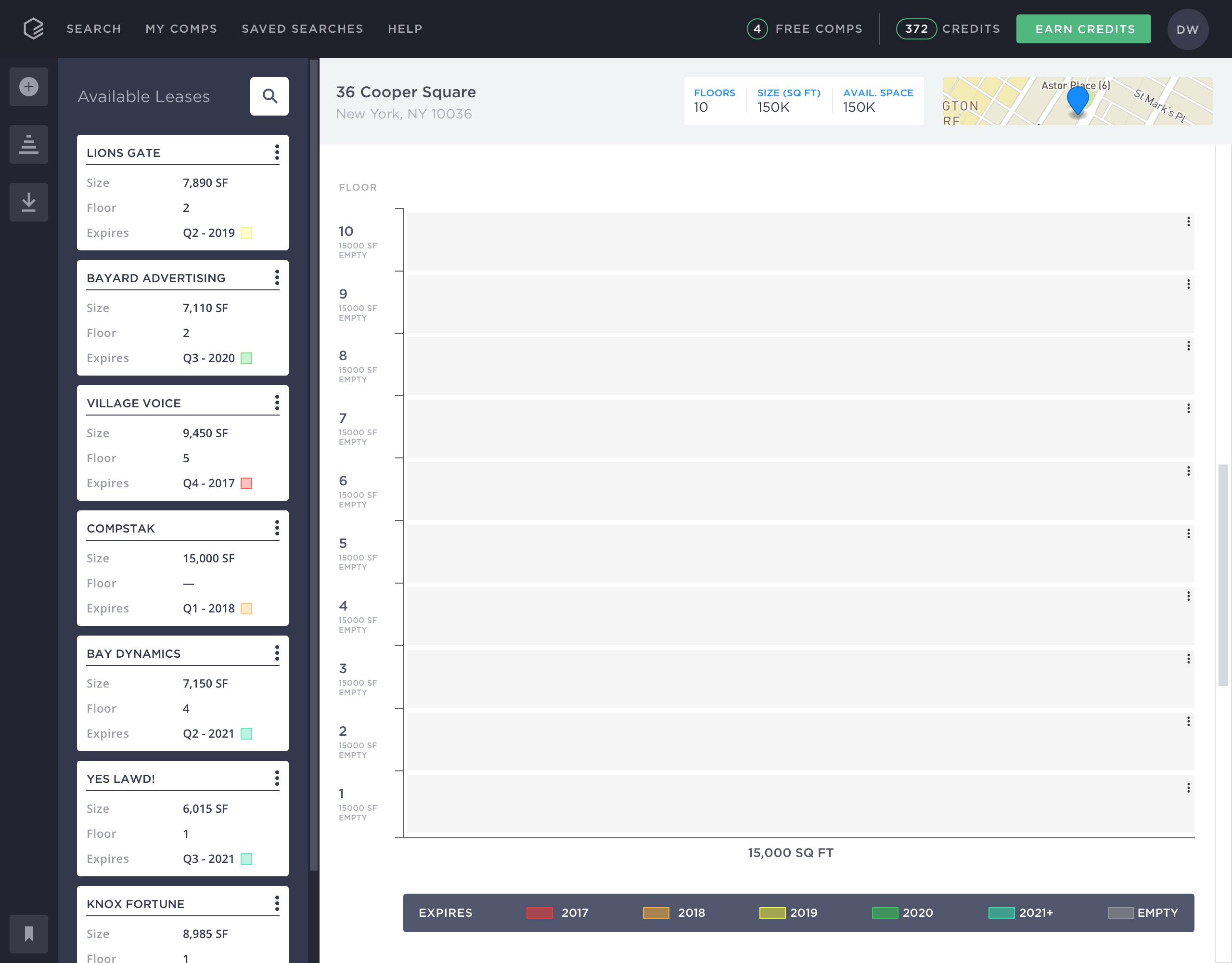
Specifically, stacking plans, tools that rely on thorough leasing data, are notoriously difficult create. Though they remain one of the best visualizations to understand a building’s floor-by-floor layout, occupancy/vacancy, or expiration timeline, the process has long been laborious.
Relaying their dissatisfaction with the creation of stacking plans, users began submitting a high volume of feedback and requests, wondering when CompStak would be able to incorporate stacking plans into our app. These requests then resulted in a “green-light” to begin R&D work
Research
Out the gate, I didn’t know enough about stacking plans to assume that I could create the optimal experience that improved upon users’ past frustration, so I asked an obnoxious amount of questions.
Reaching out to both internal and external professionals was tremendously helpful as I tried to wrap my head around stacking plans. Below are excerpts for a giant doc of questions that I created to understand both the root of the user’s problem and the true value of stacking plans as an asset in the CRE professional’s Arsenal.

Throughout all the answers that I received from interviewees three common themes were apparent:
- "The best time to pitch someone is when they're moving"
- Stacking plans go stale quickly, and scaling a building for updated information is too arduous
- Building a stacking plan in Excel is the bane of [my] existence, but often the only free option
Jobs to be Done
Using the bulk of the research, I created a Jobs-to-be-Done (JTBD) model for the entire project. Borrowing some inspiration from Intercom, JTBDs revolve around “understanding the real job customers are using [our] product for.” The overarching JTBD for Stacking Plans was, "When I’m tasked with building a stacking plan from scratch, I want to quickly gather pertinent information, so I can effectively pitch to new and existing clients.”, with a subsequent separation into two distinct categories:
Functional Jobs
- Quickly build and understand the makeup of an office building
- Avoid scaling buildings in cities with inordinate restrictions
Emotional Jobs
- Feel valued by the senior members of my CRE shop
- Relax while curating a plan from "stress-free" comfort of my desk
In fleshing out this JTBD model, we were able to settle on more focused criteria for success: increased engagement (time spent in stacking plans), frequency of interactivity, quantity of plans contributed to, and quantity of plans exported.
Sketching
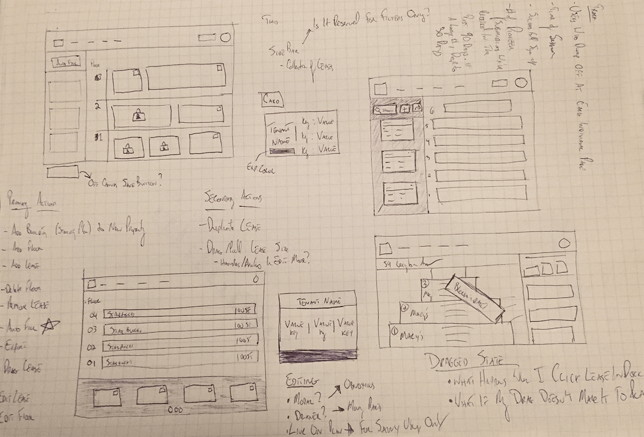
After studying stacking plans that I received from generous users or during my own hunt, I wanted to start sketching based on the following criteria that: every property should have a stacking plan that complements it, commenced leases should always be available (and expired leases should be hidden), curation is necessary (editing buildings, floors, and leases), andthere should be an ability to export a complete plan.
Proof of Concept
Following a few rounds of pen/paper sketching, I jumped into low fidelity art boards. The boards (within the prototype, below) appear more refined than the sketches because I aimed to begin hands on usability testing, validating the interactions and the inclusion of essential elements without obsessing over the aesthetics yet.
The boards aren't polished (and the users let me know it) nor did they match the company's brand guidelines, but testing with the users laid a solid foundation for what functionality needed refinement. I sat with 4 users (2 jr. brokers, 1 tenant rep, 1 landlord rep) and walked them through the prototype. By creating a hypothetical scenario, where I wanted them to imagine they were stacking the building I put in front of them, they performed a series of tasks, alerting me to momements when they were confused, frustrated, or even happily surprised.
High Fidelity
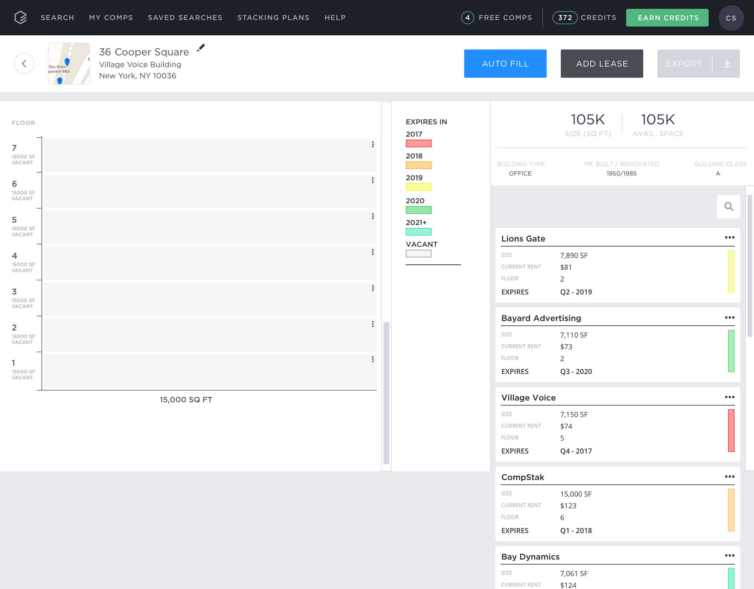
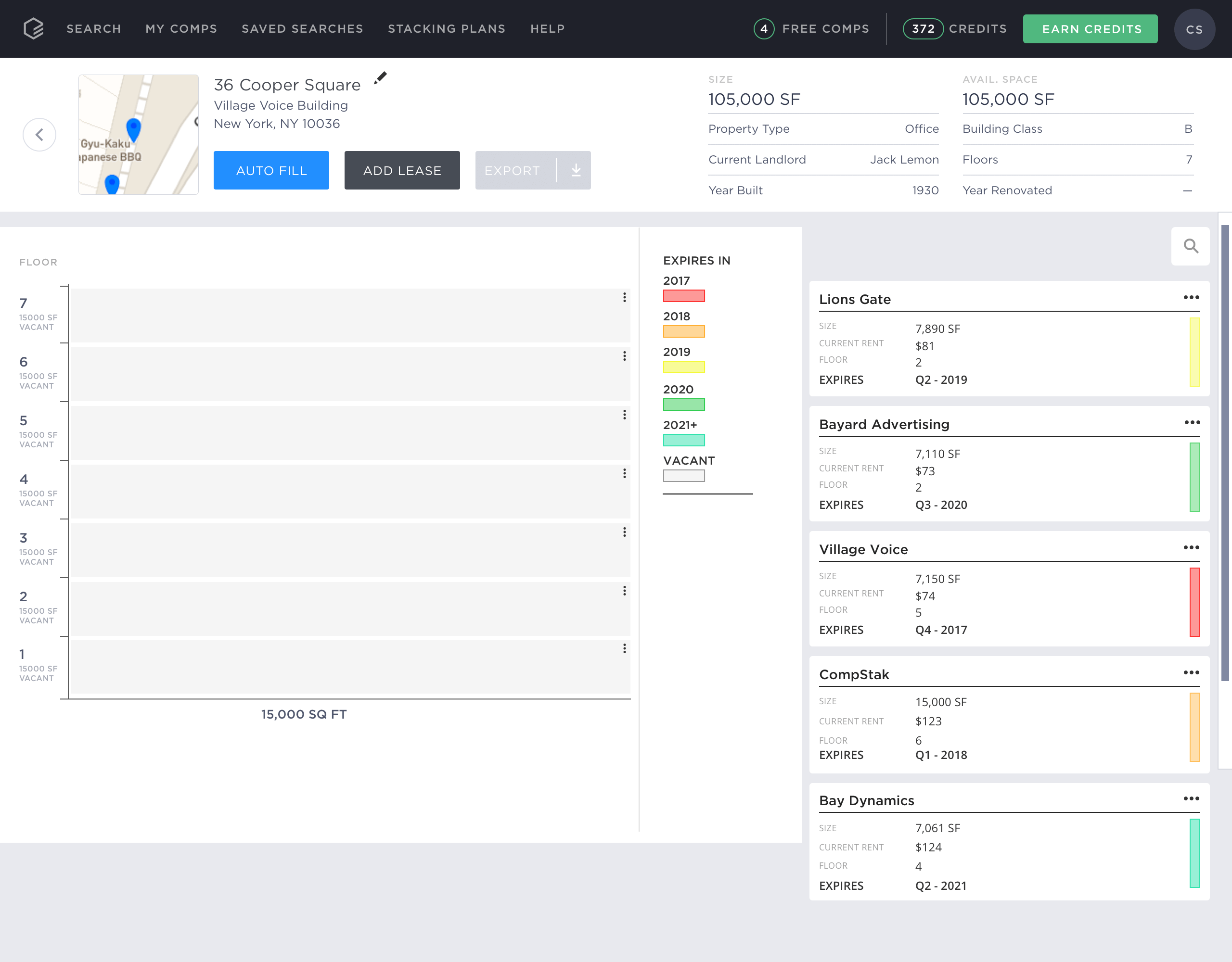
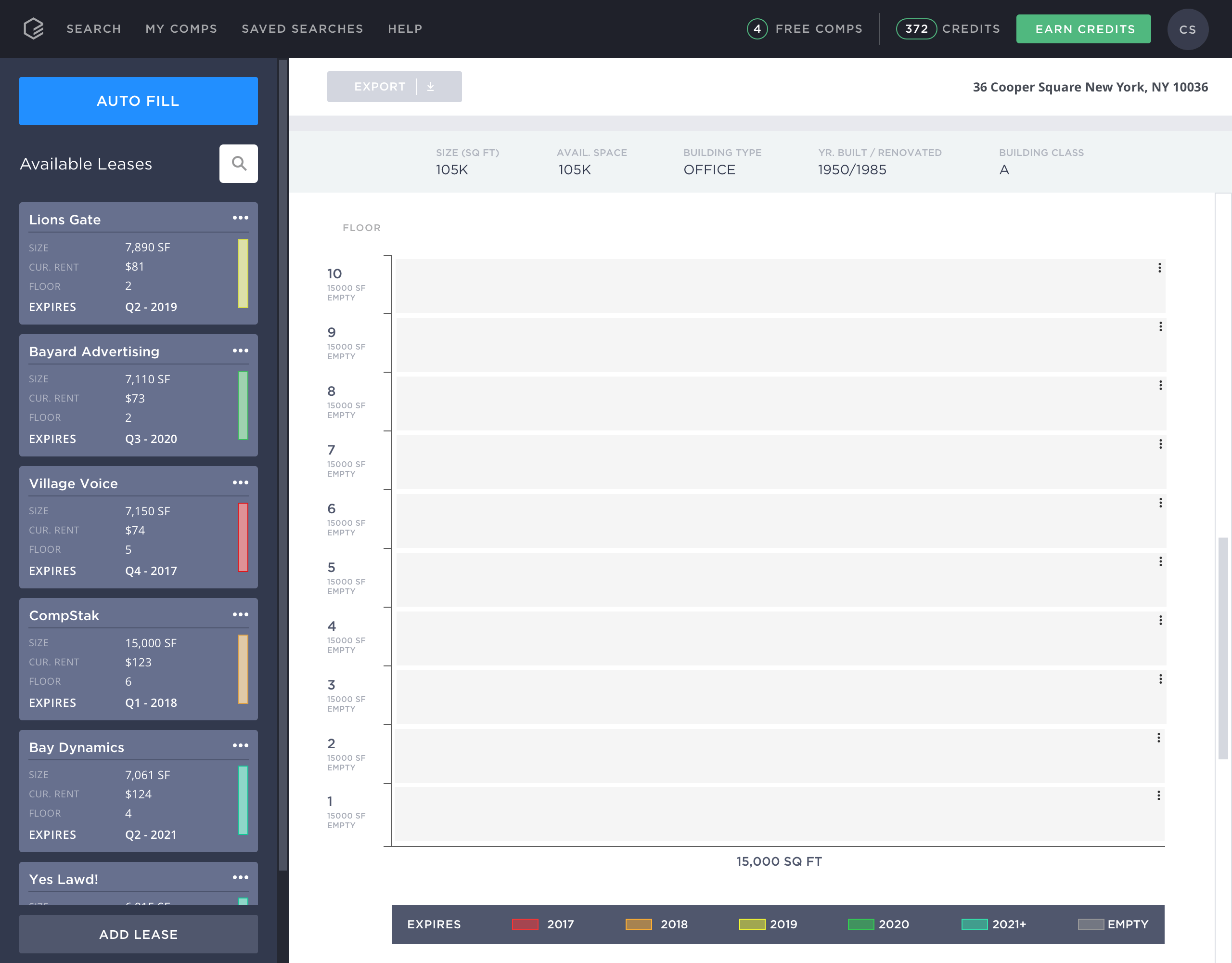
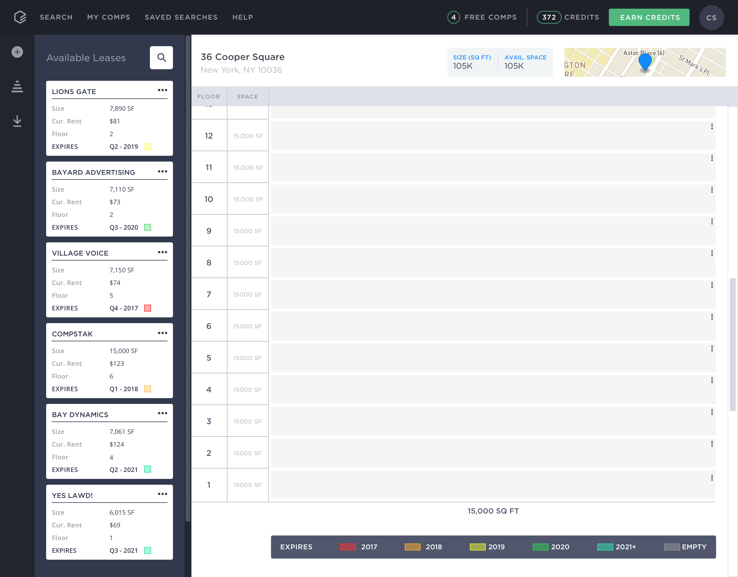
With concrete feedback, a list of “must-haves”, and a clear direction, I began polishing the artboards. These designs went through a series of iterations, each one arriving close to the final product. Below, beginning with "one", you can see how the design that's currently in app, came to be. Relying on common UI patterns allowed us to avoid reinventing the wheel and focus on the interactions and interface that would adhere to our design goals, and help alleviate our users' frustrations.
Final Prototype
Like The lo-fidelity prototype, I built the final prototype with the Principle for Mac app. I realize that there’s a huge list of prototyping software available, today, but Principle has proven (time and time again) to be the best for iterative prototype that communicates well with sketch. The ability to “mimic the real world” is crucial with user testing, especially before we commit resources to actual development, in code. If we can convince users that the prototype is a "live" version, then we can better assess and preemptively mitigate certain pitfalls and edge cases.
Design Spec
As this was one of the first CompStak tools that required an considerable amount of user input, I had to be meticulous in creating specs for our developers. With subtle interactions in each different section (component) of the Stacking Plan, I made sure to preemptively address edge cases and specify the purpose, nature, and intended duration of each action and micro interaction. To share the spec, our team relied on a combination of both Zeplin and Confluence (pictured below).
Launch
The product shipped in Q4 2017, and over 2,600 users have navigated to stacking plans. To date 77 unique users have contributed to the build of a stacking plan, 257 have exported a stacking plan, and we've recently received requests to bolster it for the Enterprise side of our app.
Future Updates
- Stacking Plan Pipeline - Throughout all of the high fidelity usability testing, our users would tell me that they were sitting on piles of already completed stacking Plans for some buildings in their respective markets, piles that they were looking to submit. At the time of release however, we only accepted submissions of lease comparable, and rent rolls. Thinking about the future, this is just another way to encourage user engagement, keep them in app, contributing to our "exchange" model. It would necessitate a completely new pipeline, one where we could scan submitted files (.jpg, .pdf, .xls etc) and populate current Plans OR implement functionality that would allow users to look at how tenancy in a building has varied year by year.
- Further Customization - The inclusion of a dynamic pdf was something that we tossed around internally, only to have the idea validated by users' inquiries. While the ability to export via .pdf exists in the app, to take it a step further, we'd want to help users customize the eventual print out based on their own criteria. Should a user want to only include the tenants they represent, they might want to modify the colors to match brand guideline (ignoring our expiration colors. OR if a user wanted to solely showcase adjacent tenants as occupied space, instead of fully detailed cells, they'd be able to do so. Currently we use wkhtmltopdf to generate .pdfs, so while the preliminary product work is done, we'd have to wait until we move to puppeteer generator to test it on a staging environment.
