
Concept
The idea of previewing a paid feature for (and educating users about) our product stemmed from an indirect user need passed to our product team from sales. We learned that one of sales’ biggest difficulties in selling the product was that users were unaware of of some features' functionality. (No, they weren’t targeting users out of segment, some of our paid features just aren't “conventional”). They were, unsurprisingly, hesitant to adopt a new tool without understanding the real value.
User Story
The project initiative, provided by our Product Manager, detailed a user story that revealed users' desire to have a trial of our feature (Crop Health Monitoring) before purchasing it. The user story also functioned as the problem definition for us because it clarified (and gave context to) user-reported-problems that we noticed prior to the commencement of this project.
Usability Testing (Offline)
Next, we spent a couple of days observing users in the app. This was not a direct Contextual Inquiry, but we still viewed recorded sessions of FarmLogs users interacting with our app (our tool: Inspectlet). Viewing these sessions helped us pinpoint the areas that the paid customers were under-utilizing, subsequently providing us with hints to where there was difficulty in understanding.
Brainstorming
...easily everyone's favorite moment during a new projects. After listing the overarching goals (derived from the Problem Definition) and agreeing on design principles to adhere to, we held a “jam” session with our design team, engineers, and marketing. Inside the room, there's an understanding among us that everything at this point should be broad, that every idea had potential (to either be great or spark a new, possibly connected idea). Even if it seems crazy...throw it on the board.

When the jam session concluded, we prioritized all of the solutions we came up with (red stars above) and let the most viable solutions serve as the springboard to our next step in the process.
Round 1: Feedback
After kicking around our favorite ideas, we had a questions for a few other teams that would help dictate next steps. Namely: what would the response time be in fetching images, were there any restrictions with content we could use, and what (if any) were the business concerns with giving previews of a feature to our users.
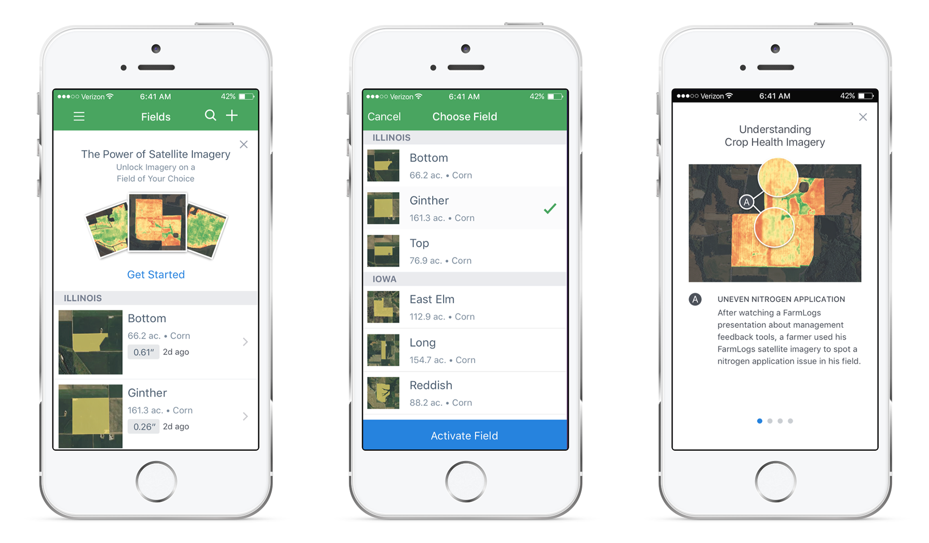
The reply from the product manager was pretty incredible. A huge user base of around 110,000 would have access to the feature (should they activate it), and allow them to select one free field for lifetime Crop Health Imagery. The images illustrate the health of crops on a user's field which is measured against a baseline to detect if anything is threatening his yield. The response time was estimated to be around 2-5 seconds for every image to load (this is brilliant in our case)
Sketches
With a clear direction it was time to begin sketching variations upon variations, upon variations... upon variations. Pen and paper immediately helped me forgo the aesthetic in order to focus on the user's potential journey.

The sketches underwent further rounds of feedback from fellow designers, engineers, and executives--consider this our internal user testing--which helped us proceeded to visual design and prototyping.
High Fidelity Visuals
Though the higher-fidelity visuals were based on the sketches, seeing colors and typography made for a seamless transition as I began creating screens for each platform. A huge takeaway from this step in the process was that changes now required a considerable amount of time because altering visuals became more time-intensive.
Prototype
I then proceeded to make prototypes with both Invision and Principle. Invision is ideal because it allowed us to share feedback directly on the prototype. Principle is awesome in it's own right because it gives users the opportunity to physically hold the prototype and tap through as though it was our actual app. (If I'm being hyper-picky, I'd love one piece of software that let me do both.)
Round 2: Feedback
Interactive prototypes became hugely helpful in soliciting feedback from other members of the team. In addition to other designers, it was necessary to loop in engineers once again.
- Design Feedback - The design feedback was mostly around the abstract nature of how the new, proposed screens fit in conjunction with what was currently in the app, around the information architecture, and ensuring that the user would benefit from the additional content/feature.
- Engineering Feedback - Feedback from the engineers was around how the pieces would fit in with the existing structure of the app and if the design components could be reusable across the app.
Handoff
The cycle didn’t end there, as we made specifications for each individual screen because of nuances about the app and actions we wanted to track to understand the behavior of our customers. The final prototypes landed in Invision and we then passed it to the developers (along with the specs and assets for each platform).

Design QA
The feature was pushed out of development in just 2 weeks, and we had the opportunity to do Design QA. These sessions allowed us to sit with developers and fix the small nuances and nits they might have overlooked going through the specifications. This part of the process hardly took more than a few hours from both me and the other designer, but it was a necessary step to ensure that the form was as solid as the function of CHI in app.
Feature Release
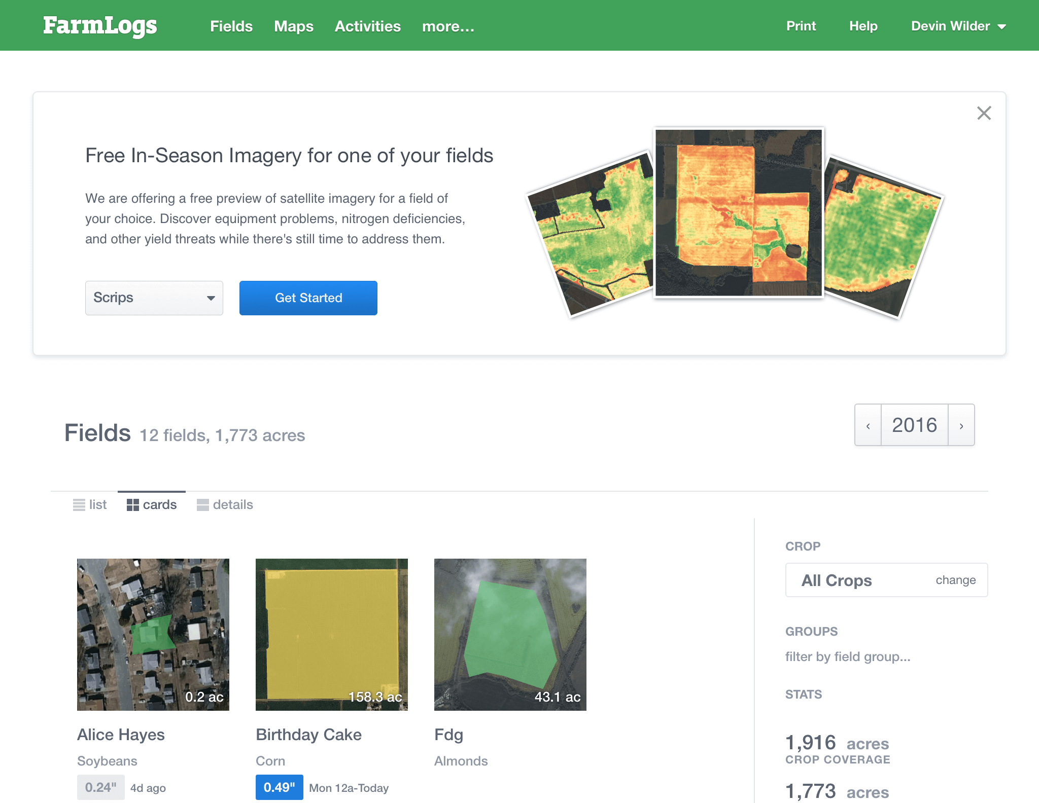
We shipped the product during the first month in Q3, and over 2,500 customers activated the Crop Health Imagery in the first three days of its release, which allowed us to further data mine and gather more insights about the final designs.
Takeaways
- Involve Your Stakeholders - The biggest setback involved engineering when they mentioned that the backend would require 2 minutes to fetch the imagery instead of 2 seconds (as we previously thought). We erred in not seeking out constant feedback from our backend engineers at each stage. Involving stakeholders like backend engineers who will play a huge role in dictating engineering constraints is monumentally important.
- "Just say no" - There was another delay in the process because as designers there was a moment where we didn’t stand by our design or defend it well when a member of our Product team had a criticism. Allocating attention to this criticism, caused a delay in the feature release, and we later learned that the "give-a-shit" level was relatively low.
- Respect the Funnel - Above, I mentioned that the purpose of the design jam session was to keep all ideas broad. The hope is that as we journey through our design process, the "funnel" becomes progressively narrower until there's one solid workflow and deliverable. Well, following that design jam, and one round of sketching, I immediately began animating. This...was a horrible idea, and IS a horrible practice. Instead of gradually working through the funnel, I immediately jumped to the end of it. The animations were polished, but the workflow still needed fine tuning. To show off the animations, was to (arrogantly) say that I had already arrived at the best solution, which wasn't true. The function of the funnel is to get your ducks in a row before committing to the right solution, advice that will be permanently tattooed on my mind.